

Inspiration

I recently posted a collection of newsletter art for the gallery, but didn’t include any information about what inspired it. This will feature some of that imagery, as well as some I haven’t shared related to what inspired it.
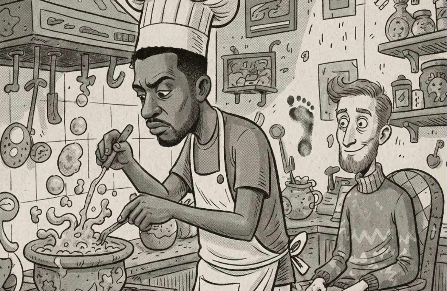
For starters, Matt Baytor himself. The character seen in the cover art looks like me, but there are a few differences. The character is thinner, with big, bulging eyes. He has more fine lines and wears specific “eras” of my hairstyles.
The art style borrows from Dr. Seuss, but the cover art for articles is in newspaper greyscale, which I liked for the main page, as it looks clean and like a newspaper!
The character is also meant to be a little mean, but he is also a gooner and a pervert. Think The Grinch and Quagmire had a baby. Also, Wario comes to mind. These aren’t bad guys. One wants love. One wants sex. One wants money! Giggity! Giggity!


To help get this idea across, he is often in the background, a voyuer, or observer.
You may notice that in some cover art, more than just the color is different. Often, a footprint can be seen in the cover art that is not on the image in the article.
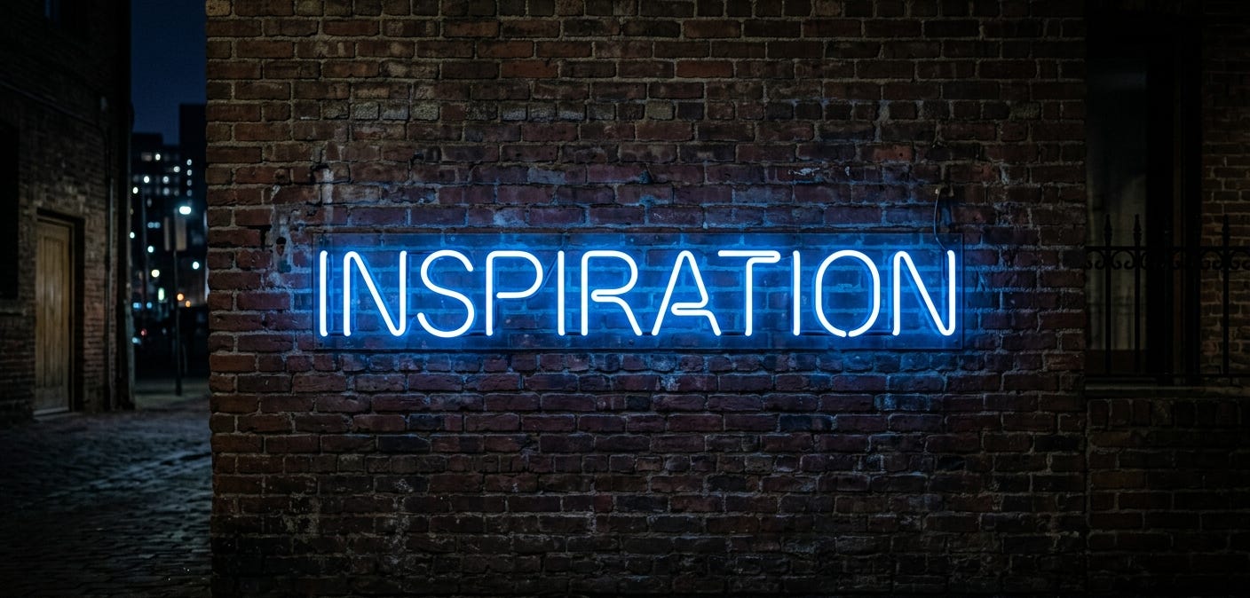
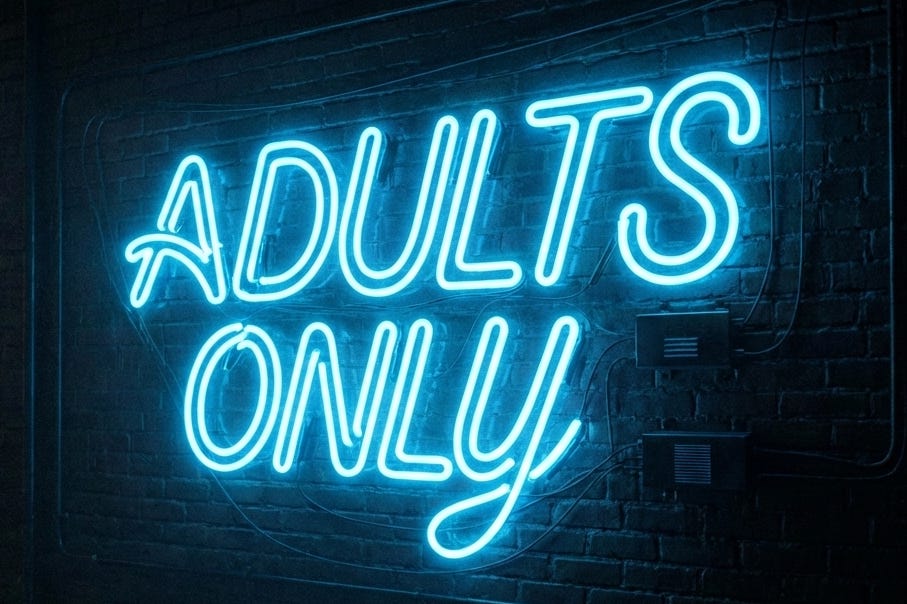
I went with shades of blue as the newsletter color palette because of the obvious… The whole “blue is for boys” dumbassery. Which is also why Boys Will Be Boys is the blue section.
The brick wall at night in the city with a blue neon sign was also inspired by this and the urban nightlife, which is when all the fun happens and when the freaks come out to play.
And who else offers curated music playlists?
There is so much to see, to read, to watch, to listen to, to fap to,
and this is just the beginning…
FIND MY CONTENT HERE: STR8 M8 2 B8 ————— [ (💲) ] <º}}}}><{{ 💦
SEND QUESTIONS HERE: EMAIL —————————-🍃<º))))>{{ 💦💦
Wanted to say thanks for the group of signs that you posted several days ago. I hope you don't mind if I used some without crediting you. I am learning how this all works and would be happy to give credit where due. Just let me know ☺️